
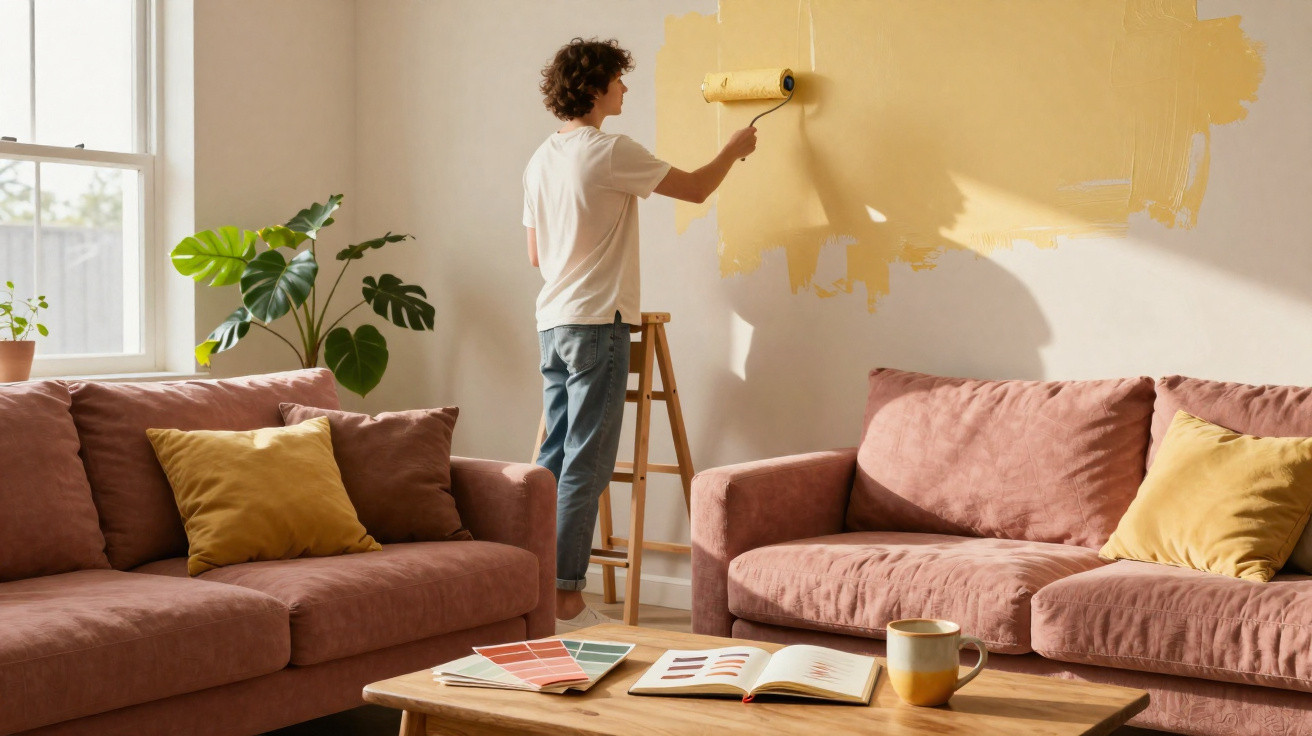
On a Saturday morning, in a flat washed in slightly grey light, the off-white sofa can suddenly feel less reassuring than it once did. It is clean, soft and perfectly matched to the rug, yet it also gives the curious sense of a room with nothing to say. We all know that moment of looking around the living room and feeling that something is missing, without knowing whether it is a vase, curtains or simply a different shade on the wall. For 2027, designers seem to have made their decision: beige is not truly disappearing, but it is no longer the automatic answer. In its place come deeper, livelier and occasionally unexpected shades that remain easy to live with. Colour is returning with warmth, memory and just enough boldness. And it changes everything.
In 2027, beige gives way to colours that tell a story
Across showrooms and newly refurbished flats, one shade keeps appearing with almost striking consistency: cocoa brown. This is not the dull brown associated with the heavy furniture of the past, but a rich, velvety chocolate, sometimes lifted with a hint of plum. Used on a living-room wall or behind the bed, it immediately creates a cocooning effect. Beige had the benefit of offending no one; cocoa gives a room presence without making it feel dark. Paired with off-white linens, pale oak and a few ceramic pieces, it creates the atmosphere of a properly lived-in home. It is the kind of setting you want to settle into when it is raining outside.
Another shade set for a strong future is moss green, more muted than the sage green that has been widely seen in recent years. A Paris-based decorator recently described repainting a couple’s bookcase in this tone when they were unsure whether to retain their white walls. The transformation was immediate: the books, picture frames and even an old velvet armchair seemed to regain their purpose. Several professional colour charts indicate that natural greens remain among the most requested shades, although yellowed, earthy undertones are now taking the lead. Moss green does not try to replicate the forest. Instead, it retains its stillness.
The third standout colour for 2027 will be petrol blue: a saturated blue threaded with green and grey, and far less formal than navy. It answers a very current desire to create calm interiors without slipping into neutral, interchangeable décor. This shade works particularly well in a hallway, kitchen or on corridor doors-areas often overlooked because we move through them quickly. Yet they are the spaces that create the first impression. Petrol blue brings a sense of sophisticated freshness, especially alongside brushed brass or matt steel. It has elegance without the chill.
Blush terracotta and butter yellow: the two most desirable surprises
To introduce these colours without turning a home into an experiment, one straightforward rule is particularly useful: begin with an area that already has a clear purpose. A wall behind the sofa, the fronts of a low cabinet, a door frame or the back of an alcove are all enough. Blush terracotta is especially easy to embrace in a living space because it catches the light without making it harsh. Paler than traditional terracotta, it calls to mind mineral pigments, old façades and late summer evenings. Combined with linen, a woven rug or dark wood, it warms the whole scheme naturally.
Butter yellow, meanwhile, may be the colour that divides opinion at first glance but wins people over in everyday life. Many fear a 1990s-kitchen effect, and that caution is understandable. The right version is neither lemony nor bright: it is creamy, almost powdery, like morning light falling on an off-white wall. In a bedroom, it can readily replace beige, retaining its calming quality while bringing more depth to textiles. Let us be honest: no one really repaints their home for every trend. It is wiser to confine this yellow to one wall, a chest of drawers or generously sized curtains.
Designers stress one point: these new colours do not require entirely new décor; above all, they call for more considered conversations between materials.
“The most successful colour is not the one that impresses on a colour chart, but the one that makes a room more pleasant to live in at eight in the morning as well as at ten at night,” sums up interior designer Clara Ménard.
- Cocoa brown: ideal with walnut, brass and boucle textiles.
- Moss green: perfect for enlivening a bookcase, study or dining room.
- Petrol blue: best suited to circulation areas and bright rooms.
- Blush terracotta: a warm choice for the living room or bedroom.
- Butter yellow: bright, soft and surprisingly easy to pair with pale wood.
The real 2027 interiors trend: choosing a colour you want to see again tomorrow
These five shades share one quality: they do not try to erase everyday life. They accommodate the marks of a throw left slightly askew, stacks of books, toys in a corner and meals that run on too long. Beige will remain a useful foundation, particularly in small rooms or homes with limited natural light, but it no longer needs to rule alone. A more confident colour can become the thread running through an interior without imposing a fixed atmosphere. Perhaps true luxury today is not a perfectly coordinated home. It is having a room in which you genuinely recognise yourself.
| Key point | Detail | Added value for the reader |
|---|---|---|
| Cocoa brown | A deep, warm shade that is softer than a classic brown | Creates a cocooning living room without darkening the space |
| Moss green and petrol blue | Nature-inspired colours with complex undertones | Adds character to walls, furniture and circulation areas |
| Blush terracotta and butter yellow | Two bright tones to use in small touches or across a focused surface | Replaces beige with warmth, without taking excessive risks |

Comments
No comments yet. Be the first to comment!
Leave a Comment