
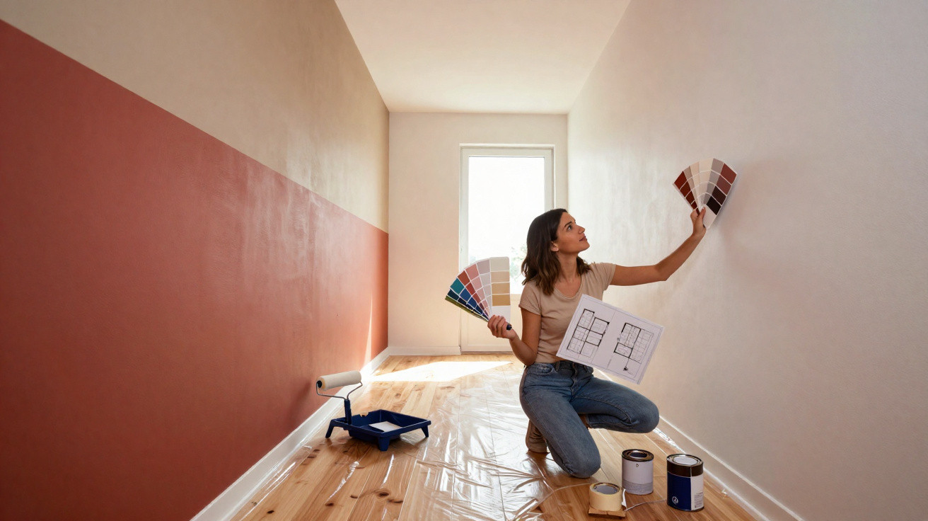
Rather than repainting everything or even moving walls, interior professionals are now using a trick borrowed from the beauty world: carefully placed colour can visually slim, elongate or balance rooms – much like contouring does for the face.
The principle behind room contouring
The concept is straightforward: paint strategically rather than simply choosing a colour that looks nice. Colour becomes a tool for correcting proportions and directing the eye. Light and dark shades each have a distinct role.
“Room contouring uses the same effect as make-up: dark shades visually recede, while light ones come forward – creating new proportions without moving a single brick.”
Helen Shaw, colour expert at Benjamin Moore, describes the approach as using graduated tones across walls, ceilings, alcoves, mouldings and other features to bring some surfaces forward while visually pushing others back. This can make a room feel deeper, more harmonious or more orderly, even where its layout is challenging.
The technique works directly with how we perceive space:
- dark shades appear to recede
- light shades seem to move towards you
- gentle transitions can soften harsh edges
- deliberate contrasts guide the eye towards focal points
No actual square metres are gained, but the sense of space can change dramatically. A cleverly positioned coat of paint can make a seemingly endless corridor feel shorter or make a vast, chilly living room feel more inviting.
Typical awkward rooms when the layout is wrong
A long, narrow-looking living room
Many people know the problem: a living room that feels like a tunnel. Once the furniture is in place, the whole scheme can seem restless and unbalanced. A standard all-purpose white paint finish often makes this impression even stronger.
With room contouring, the perceived length can be interrupted. In one practical example, designer Melissa Oholendt completely changed the feel of a very large, elongated living space without structural work – using colour alone.
- the main walls were painted in a darker shade
- the ceiling area above the living room was defined in a warm taupe grey
- adjoining areas, including the hallway and dining room, were given lighter yet related tones
This created understated zones. The room now appears shorter, cosier and less like a sports hall. Darker walls visually draw the surfaces closer, while the subtly differentiated ceiling still links the living room harmoniously with the neighbouring spaces.
A large room with a cold atmosphere
Large does not automatically mean comfortable. High ceilings and expansive floor areas can feel cold and empty, especially where everything is painted white. This is precisely where darker paint comes into its own.
“Dark shades on individual walls or within alcoves ‘draw’ the room together, creating a feeling of closeness – ideal for generous but sterile living areas.”
A back wall in the living room painted deep petrol blue, a fireplace in warm charcoal grey or a corner in rich green can all focus the eye and remove the chill from an expansive space. Paired with warm materials such as wood and textiles, these surfaces create a homely, almost embracing atmosphere.
A claustrophobic loft room or attic space
Sloping ceilings make many people uneasy: the ceiling is low, it is easy to bump your head, and the room can feel cramped. The conventional response is to paint everything white so that it looks “bigger”. This can work, but it can also heighten the sense that the slope is pressing down on you.
A bolder room-contouring approach is worthwhile:
- paint the vertical walls in a warm mid-tone
- choose a shade one or two tones darker for the slope
- if needed, make one end wall noticeably darker to create depth
The darker slope appears to recede, making the room feel less like a low box. The lighter upright surfaces provide orientation and make the space appear more clearly structured.
An endless, narrow hallway
Hallways are ideal candidates for room contouring. They are often too long, too narrow and receive little natural daylight. Here, colour can be used very deliberately to soften the tunnel-like effect.
Typical techniques include:
- paint the end wall in a darker, warm shade – this visually brings the far end closer
- keep the side walls lighter and more restrained so they do not feel enclosing
- make the ceiling a touch darker than the walls so the passage feels less lofty and hollow
Combined with targeted lighting, the hallway can suddenly feel like a deliberately designed area rather than merely a route through the home.
Using colour to highlight architectural features
Room contouring does more than correct proportions; it can also showcase individual architectural features instead of trying laboriously to conceal them.
Interior designer Jennifer Hunter demonstrates this with a large window frontage. Rather than disguising its dominant shape, she chose to emphasise it deliberately:
- the remaining walls were kept calmer and more understated
- the window reveal was painted in a warm, cheerful yellow
- textiles and patterns around the room subtly echoed the colour mood
“Light, cheerful shades on projecting elements such as bay windows or large windows draw the eye directly there and enhance spatial depth.”
Because the window frontage already projects into the room, the lighter shade intensifies this effect and establishes a clear focal point. The eye anchors itself on the window area, making the room feel deeper and more alive. Combined with floral wallpaper, it almost creates the impression of standing at the edge of a meadow.
Matt, satin or gloss: choosing the right finish
The effect depends not only on the paint colour itself, but also on its finish. Different sheen levels reflect light in different ways, which in turn affects how the room feels.
| Finish | Effect on light | Best suited to |
|---|---|---|
| matt | reflects very little light; feels calm and deep | large surfaces, back walls, alcoves |
| velvety / satin | a slight sheen; hard-wearing and subtly lively | living rooms, hallways, children’s rooms |
| gloss | highly reflective and emphasises every edge | doors, mouldings, individual accents |
Helen Shaw clearly recommends matt or velvety finishes for any areas that are meant to be “modelled”. They absorb some of the light, reinforcing the impression of depth. Gloss paints reflect strongly and may undo exactly this effect, as every edge and imperfection becomes visible.
In practice, this means choosing matt or velvety paint for broad wall and ceiling areas, while picking out details such as doors, fitted units or window frames in a slightly glossier version.
How to use room contouring at home
Anyone wanting to try the technique does not need to transform the entire house at once. A considered step-by-step process helps prevent costly mistakes.
- Define the problem clearly: Does the room feel too long, too low, too high, too large or too unsettled?
- Decide where to direct the eye: Where should attention land first: the window, sofa, dining table or fireplace?
- Plan the colour contrasts: Which surfaces should recede by becoming darker, and which should advance by becoming lighter?
- Select the finish: Choose matt for spatial effect, using gloss only very selectively as an accent.
- Test first: Check sample cards at different times of day before opening the large tin of paint.
Especially in small flats, a single well-placed colour accent can have a remarkable impact: a dark wall behind the bed, a defined ceiling border in the living room or a gentle colour transition from the hallway into the living area.
Risks, limits and useful combinations
Naturally, it is possible to overdo the technique. Too many sharp contrasts can quickly make an already unsettled layout feel even more hectic. Painting every projection, alcove and corner in a different colour is more likely to create chaos than clarity.
One simple rule is helpful: use no more than two or three main shades per room, plus one or two accent colours that recur. This keeps the overall look calm even when proportions are being deliberately modelled.
Lighting and textiles are strong partners for room contouring. Focused lighting on a dark wall creates depth, while a rug ending along the same line as a colour-defined wall surface reinforces the intended zoning. Curtains can visually lengthen or shorten tall windows, depending on how high they are fitted.
Once you understand the basic principle, it can be used flexibly: in a home office that should not feel like an office, in children’s rooms that can grow with the child, or in a rented property where moving walls is not permitted. Room contouring usually costs little more than a few tins of paint and some time, yet the everyday difference can still feel as significant as a minor renovation.




Comments
No comments yet. Be the first to comment!
Leave a Comment