
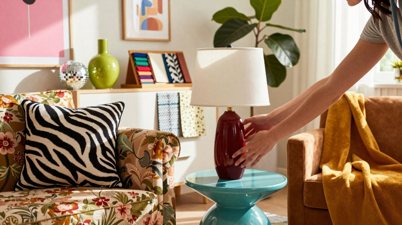
Neon cushions, competing prints and shelves packed with trinkets create a deliberately loud, nostalgic and slightly chaotic feel.
Following years of beige sofas and immaculate coffee tables, homes are becoming more colourful, more cluttered and much more individual. The daring aesthetic that many design insiders previously dismissed as tasteless is gradually returning to mainstream interiors, particularly as the darker months set in.
The return of kitsch: why maximalism will not stay cancelled
For a period, the interior design formula seemed straightforward: white walls, light timber, one decent candle and perhaps a plant that appeared to come with its own content strategy. Anything brighter risked being criticised as cluttered or “trying too hard”. Now, however, the pendulum has moved in the other direction.
Maximalist kitsch, once ridiculed as “the ugliest trend of the decade”, now reads like a mood booster for anxious times.
Homeware retailers, textile labels and independent makers are seeing increased interest in saturated hues, vintage-inspired patterns and standout decorative pieces. Social media feeds that were once filled with stoneware mugs and cream bouclé now feature cherry-red lamps, checkerboard rugs and floral sofas that would have been called “too much” just a few years ago.
Colour that shouts: how bright tones replaced neutrals
Rich shades are overtaking sandy schemes in bedrooms and living rooms. An electric-blue throw is placed over an oatmeal sofa, while bubblegum pink, burnt orange and acid yellow appear on lampshades, vases and side tables. Tableware is becoming bolder too, with mismatched glasses and plates recalling 1970s party sets.
These colours are particularly effective in winter, when daylight is limited and evenings at home become longer. A dark-red rug or citrus-yellow occasional chair can offset the dull light that makes minimalist interiors seem chilly or vacant.
Maximalism trades “calm at all costs” for something closer to visual comfort: warmth, humour and a hint of drama.
Patterns are moving in the same direction. Oversized florals, checkerboards, squiggles, leopard print and retro geometric motifs are layered over bedding, curtains and cushions. The style does not rely on perfectly coordinated sets; it embraces contrast instead, placing a formal chintz beside a graphic stripe or a glossy mushroom lamp on mid-century timber.
Nostalgia with an agenda: what this “ugly” trend reveals about today
This renewed interest in kitsch has several emotional influences behind it:
- Comfort through memory: granny-style florals, sweet-shop colours and glass ornaments evoke childhood houses and holiday lets.
- Rebellion against sameness: people weary of identical “Instagram apartments” are looking for rooms that feel distinctive and lived-in.
- Visual warmth: dense colour and layered textiles can make spaces feel more protective during long, grey seasons.
There is also a subtle rejection of the belief that good taste must mean restraint. In many cities, rents are expensive, homes have limited floor space and everyday life feels intensely optimised. A mildly over-the-top sitting room offers permission to relax. Displayed possessions – old vinyl records, inherited porcelain or a ceramic dog from a charity shop – tell small stories and show that a real person lives there.
Controlled chaos: using maximalist kitsch without ruining a room
Those who dislike the trend often fear visual overload. That possibility is real, but considered decisions can prevent an energetic space from resembling a prop store. The aim is not to fill every available surface, but to build layers of interest while leaving space for the eye to pause.
Think of maximalism less as hoarding and more as curation with a softer dress code.
How to mix patterns without creating a headache
A straightforward framework is useful when combining prints:
- Limit a room to roughly three main patterns, such as a floral, a stripe and an animal or geometric design.
- Connect them with one recurring colour, whether green, red or blue.
- Leave one substantial area relatively calm, such as plain walls or a solid-colour sofa.
Accessories do much of the work. Fringed lampshades, retro posters, dramatic throws and patterned cushions can alter a room more quickly than replacing furniture. They are also easy to move: a striped pouffe can travel between rooms, while a bright blanket can move from the bed to an armchair, shifting the atmosphere without any renovation.
Another useful approach is to create a maximalist “zone”. A reading nook, desk space or console table can hold the high-impact objects while the rest of the room remains more restrained.
Texture as a safety net: balancing gloss, softness and solid materials
Texture keeps vivid colour from appearing one-dimensional. Juxtapositions of rough, smooth, soft and shiny finishes give the eye somewhere to settle, helping the room feel less chaotic.
| Element | Maximalist choice | Balancing partner |
|---|---|---|
| Seating | Velvet or bold patterned fabric | Plain cotton or linen cushions |
| Surfaces | Coloured glass, lacquered trays | Light wood, rattan, unglazed ceramics |
| Textiles | Fringed lamps, shaggy rugs | Flat-weave rugs, simple curtains |
Lighting matters enormously. Warm, low-level lamps, fairy lights and coloured-glass shades soften powerful palettes and make the overall mix feel welcoming. Cool overhead LED lighting can make the very same pieces appear severe and cluttered.
Should you embrace the kitsch crowd or leave it alone?
No one has to repaint an entire flat in acid shades to take part. Maximalist kitsch can suit different budgets and comfort levels, from a single playful vase to a complete gallery wall. The larger consideration is how loudly you want your home to express your personality.
Testing the trend or committing fully: two approaches
For more cautious decorators, small additions can already transform the mood:
- A few deliberately clashing cushions on a neutral sofa.
- A single patterned rug beneath a coffee table.
- A group of coloured candles or glass vases displayed on a shelf.
People with a stronger appetite for visual drama may take a more adventurous path, choosing removable statement wallpaper for one wall, a patchwork arrangement of framed prints or a second-hand floral armchair as the room’s focal point.
The point is not perfection but personality; if it makes you smile when you walk in, it earns its place.
Key pieces that turn a flat winter room into a joyful one
When light is scarce and the days begin to feel repetitive, certain items can make a significant difference:
- Patterned cushions that can be changed with the seasons and layered over sofas or beds.
- Vintage-style rugs in faded florals or strong graphic designs to warm bare floors.
- Statement lamps with pleated or fringed shades that create a gentle, tinted light.
- Coloured glass or ceramic ornaments that catch fairy lights and lamplight, producing small points of interest.
One understated advantage of this trend is that it suits restricted budgets. Rather than buying everything new, people can search attics, charity shops and online marketplaces. Old sets of crockery, floral tablecloths and unusual ceramic animals suddenly look fashionable. The object’s story can matter just as much as its appearance.
Beyond fashion: how maximalist kitsch can shape daily life
Interior trends usually shift more quickly than most people can redecorate. Even so, a more expressive home can bring practical benefits. A busier, more personal space may be easier to live in than one that is perfectly styled. Scuffs and mismatched glasses feel less important when the room already celebrates imperfection.
The style also supports low-pressure creativity. Moving around a collection of prints, painting a picture frame in a bright shade or making a cushion from leftover fabric turns decoration into an ongoing pursuit rather than a single costly project. Some households even make it a shared pastime, moving objects between rooms or exchanging finds with friends as their tastes evolve.
There are compromises to consider. Bold patterns can look dated more quickly, while highly saturated colours may become tiring for some people over time. One useful test is to trial the look before making a commitment: gather everything colourful you already own in one corner, live with it for a week and see whether it feels energising or unsettling. This short experiment often shows where your natural tolerance for visual noise lies.
For renters, or anyone reluctant to use strong paint colours, lighting and textiles provide a lower-risk option. Removable wallpaper, fabric panels displayed like artwork and plug-in wall lamps add depth without making permanent alterations. Once the trend fades, these pieces can be moved, stored or reused, while the home retains the confidence and playfulness that maximalist kitsch has helped to release.



Comments
No comments yet. Be the first to comment!
Leave a Comment