
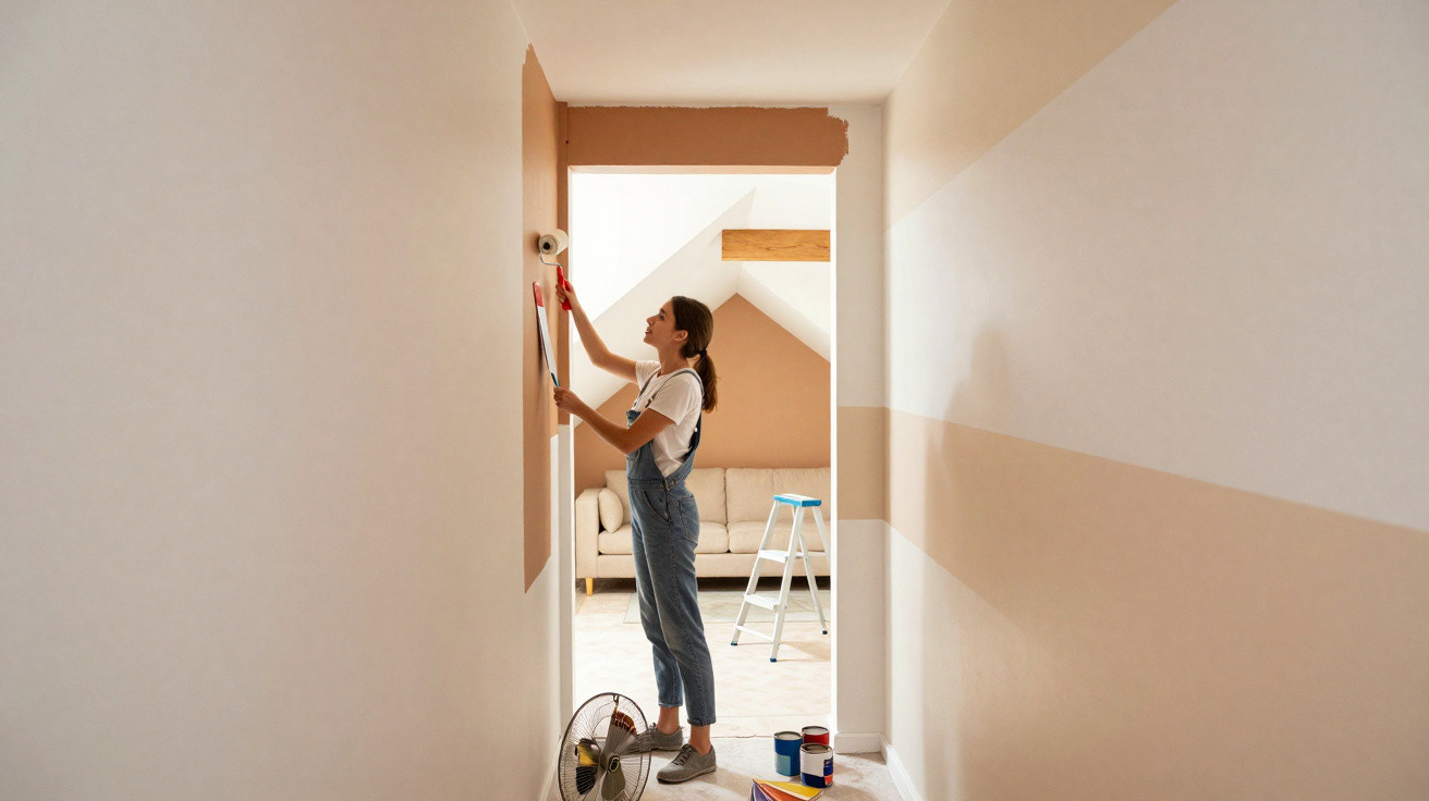
Long, tube-like rooms, oppressive sloping ceilings and seemingly endless corridors: many homes feel somehow “badly proportioned” – yet more can be changed than you might think, without builders, dust or demolition.
Architects refer to unfavourable proportions, while tenants generally just call them “oddly laid out”. What many people do not realise is that carefully chosen wall paint can dramatically transform the sense of a room. A newer technique inspired by make-up contouring uses light, shade and contrast to visually alter walls, ceilings and alcoves – without changing the floor plan.
How Contouring with Paint Tricks Awkwardly Shaped Rooms
Traditional decorating is often simply about finding an attractive colour. With so-called room contouring, a different question comes first: where should the eye be drawn, and what should recede into the background?
The idea: dark shades make surfaces appear to recede, while light ones visually bring them forward – allowing a room to be genuinely shaped.
Colour experts describe the result like this: graduated levels of brightness and deliberately placed contrasts across walls, ceilings, alcoves and mouldings create depth and structure. A featureless room appears more defined, an overly imposing detail finds its proper place, and a cool large-scale space gains visual anchoring.
The key point is that this is not about colourful experimentation, but strategy. Working with light and shade unconsciously guides perception. Our brains “read” dark areas as more distant and light ones as closer. The floor plan remains exactly the same, but the feeling on entering the room is entirely different.
Common Problem Rooms and How Contouring Saves Them
A corridor that is too narrow
A familiar feature in both period homes and new builds is the long, tight hallway that feels like a tunnel.
- Emphasise the shorter walls: Paint the end wall of the corridor darker than its long side walls. It will appear visually closer, making the passage feel less “endless”.
- Lighten the long walls: Light, softly muted shades on either side can make the width feel more generous.
- Keep the ceiling neutral: A mid-tone that does not draw much attention stops the ceiling from feeling oppressive.
Even two paint shades can make a corridor seem shorter, wider and less tube-like – ideal for rented homes too, where major alterations are not an option.
A huge living room with no atmosphere
Open-plan living and dining spaces are fashionable, but can quickly feel cold and sports-hall-like. This is precisely where room contouring comes into its own.
An international designer demonstrated this in a large living area by selecting a darker, muted shade for its high walls. The outcome was that the surfaces visually receded, so the room no longer felt like an empty hall but more sheltered.
Darker walls give large rooms visual boundaries – they suddenly feel like a home rather than a reception hall.
The ceiling treatment was especially interesting: rather than pure white, a warm greige shade – a mix of grey and beige – was used. It gently links the living area to adjoining rooms without creating a harsh divide. This creates zones without putting up partition walls.
A sloping ceiling that overwhelms the room
Bedrooms in loft spaces in particular have a recurring issue: the slope can feel low and oppressive, making the room seem smaller than it really is.
- Lighten the slope: A very pale, slightly cool shade on the sloping surface makes it appear to rise upwards.
- Highlight the gable wall: The end wall can be a little darker, which makes the room feel deeper rather than lower.
- Paint soft transitions: Using the same shade on the sloped surface and ceiling avoids harsh lines that cut the room up.
With the right tonal graduation, a loft room feels less cramped, even though nothing has changed structurally.
Highlighting Architectural Details Deliberately
Room contouring is not only useful for concealing awkward features; it can also bring them into focus. Take a large window wall or a bay window that has previously been seen only as an “odd protrusion”.
One interior designer turned such a window area into the focal point of a bedroom. She painted the entire bay in a warm yellow that was noticeably lighter than the rest of the room. The eye is automatically drawn there, the depth of the recess appears stronger, and the view is almost pulled outdoors.
Light, warm colours on projecting architectural features direct the eye outwards and give the room a clear centre.
Combined with floral wallpaper in the remainder of the room, this created the impression of lying in a kind of flowering meadow. The paint in the window area reinforces the theme of “light and nature” rather than competing with it.
The Role of Matt, Satin and Gloss Finishes
Many people underestimate how strongly a paint’s sheen level affects the final result. The shade itself is not the only factor; the finish matters too.
| Finish | Characteristic | Ideal for |
|---|---|---|
| Matt | Reflects very little light, appears calm and disguises imperfections | Large surfaces, recession effects, alcoves, high walls |
| Satin / velour | A subtle sheen, hard-wearing and still relatively understated | General wall areas, living spaces, children’s bedrooms |
| Gloss / high gloss | Strongly reflective, highlights every edge and can make surfaces look “flat” | Accents on doors, built-in units and frames – use sparingly |
Matt paints absorb light and create depth, making them ideal when a wall should visually recede. High-gloss finishes, on the other hand, reflect 70 to 100 per cent of light. They draw attention to every transition and can undo the intended sense of depth.
Colour specialists therefore recommend using matt or velour finishes on large surfaces for the actual contouring, while reserving satin or gloss finishes for accents such as doors, shelving and mouldings.
Practical Rules for Your Own Home
Start with small areas
Anyone who feels unsure should begin with an alcove, projection or hallway rather than the living room. Two or three graduated shades from the same colour family are often enough:
- lightest shade: surfaces that should seem closer
- mid-tone: “normal” surfaces and the overall mood
- darkest shade: areas that should recede or create a frame
It is worth looking at test swatches at different times of day. The effect in morning light differs from the evening, especially in north- and south-facing rooms.
Use contrasts deliberately, not everywhere
Inspired by before-and-after images, some people paint every corner a different colour. This overwhelms the eye and destroys the calm effect. It is better to make one or two clear decisions per room.
Examples:
- Darken only the end wall in the bedroom, keeping the other walls lighter.
- In the living room, graduate the colour only behind the sofa and on the ceiling.
- In the corridor, accent just the end wall and door frames.
Risks, Limits and Useful Combinations
Starting without a plan can create visual disruptions: a beam painted too dark across a room can make it seem lower than it is. Extremely cool shades can also quickly feel unwelcoming in rooms that are already dark.
One simple rule of thumb is useful: the smaller and lower the room, the softer the contrasts should be. Dramatic light-dark shifts are better suited to spacious rooms with high ceilings.
Room contouring becomes especially effective when combined with lighting. Wall washers or concealed LED strips along a wall painted in dark matt can create a depth that is difficult to achieve with plain white paint alone. The same applies to textiles: rugs and curtains in similar tones noticeably reinforce the intended effect.
Anyone who remembers the make-up principle – highlighter, bronzer and shading – will quickly understand the logic. You emphasise what the eye should notice and let other elements become quieter. That is exactly what contouring with wall paint achieves: no pneumatic drill required, just a few tins of paint and a clear plan.




Comments
No comments yet. Be the first to comment!
Leave a Comment