
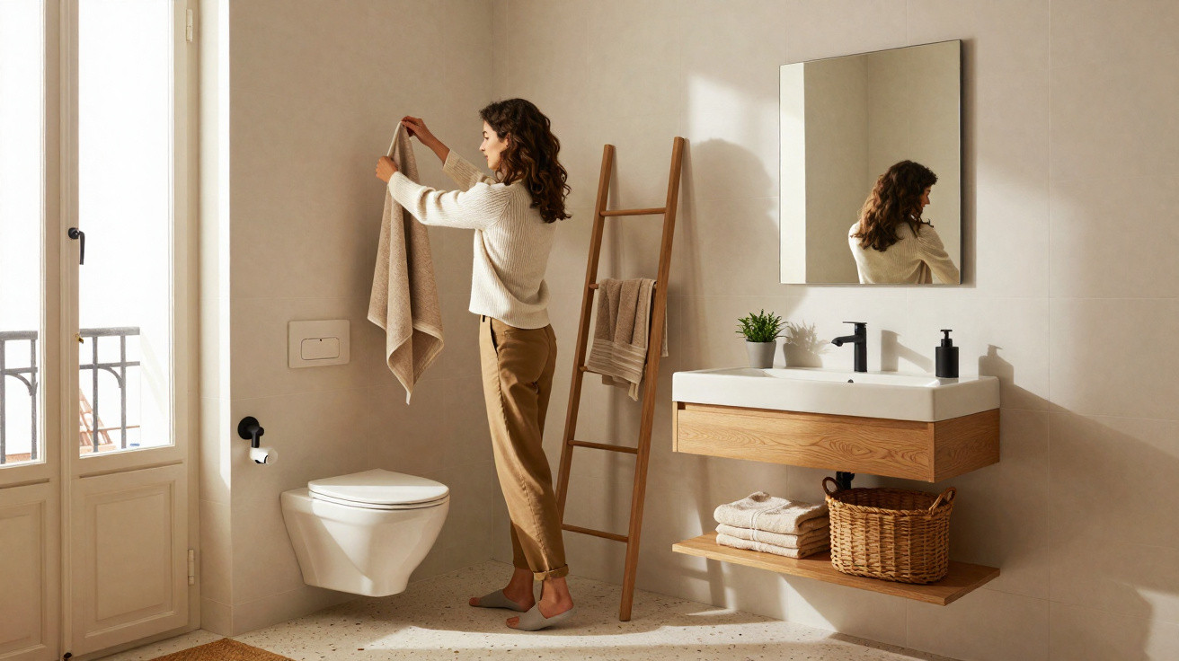
A Parisian micro-apartment measuring just 15 square metres had long seemed frozen in another era. The sanitary area in particular was deeply problematic: impractical, dark and far from welcoming. An interior design studio took on the challenge and remodelled the space so that it now resembles a small, contemporary jewel box.
From makeshift solution to problem area: how bad it really was before
The original wet room reflected a familiar feature of older city flats, where every centimetre matters – albeit in the most uncompromising way. Rather than a proper bathroom, there was a combined toilet and shower area. The shower was positioned directly above the WC, with the toilet pan effectively serving as the shower base.
To take a shower, the occupant first had to lower the toilet seat and operate the shower head immediately above it. There was no curtain or partition whatsoever. The floor became soaking wet, towels had no designated place, and the entire arrangement felt improvised.
Visually, the room offered little appeal as well: bare walls, a tiny basin with no storage, and hardly any surface space. The wet room conveyed more of a “storage cupboard with a water connection” than a “bathroom”, and that was precisely what needed to change fundamentally.
“The old wet room was of questionable functionality, unattractive and wasted potential – a classic case for radical replanning.”
The strategy: every centimetre matters in the 15-square-metre studio
Rather than making superficial improvements, the interior team opted to completely reorganise the miniature bathroom. The aim was to create a fully functional, comfortable sanitary space within a minimal footprint, without making the tenant feel cramped.
The designers based their approach on three key principles:
- Clear zoning for the washing area, toilet and shower
- Compact, made-to-measure fittings rather than standard-sized products
- Calm, consistent design to give the bathroom a unified appearance
Clever layout: corner vanity and wall-hung WC
One crucial move was the placement of the vanity unit. Instead of positioning it centrally against a wall, the team set it diagonally into a corner. This released valuable centimetres of circulation space along the main route through the room.
That small buffer then became a genuine improvement in comfort: it suddenly provided enough room for a wall-hung WC. Not only does this type of model appear lighter and more modern, but it also makes cleaning easier because the floor beneath remains clear.
For the shower, vanity and radiator, the designers selected especially slim versions made specifically for small bathrooms. The shower received a space-saving glass door, the vanity remained compact, and a narrow heated towel rail was fitted to the wall. This made it possible to incorporate every essential function without overwhelming the room.
“The renovation demonstrates the powerful effect of tailored solutions: a bottleneck becomes a surprisingly comfortable everyday space.”
From stripped-back shell to a modern, welcoming look
The revised layout alone was not enough. It was the design concept that transformed the former problem area into a cohesive small designer bathroom. The planners chose soft, rounded forms and paired them with striking black details.
Curves appear, for example, in the mirror and in the lines of the vanity. These gentler shapes soften the severity of the limited room size. At the same time, black metal creates strong accents in the mirror frame, the tapware and the profiles of the glass shower screen.
This combination of materials lends the compact wet room a hint of boutique-hotel character. The black elements also echo the industrial feel of the rest of the studio. As a result, the flat feels harmonious overall rather than like a patchwork of styles.
Why the design makes the room appear larger
The new bathroom relies on a continuous design scheme. Instead of combining numerous colours and forms, the team maintained one clear visual direction. This allows the eye to take in the space more easily and makes it seem more generous.
Three design techniques stand out in particular:
- Repeated black details provide structure and create a visual thread.
- Light surfaces on the walls and floor amplify the sense of brightness.
- Glass and slim profiles have little visual weight, making the room feel lighter.
The wet room is therefore no longer a dark functional corner, but a small, bright retreat for everyday use – despite its extremely compact footprint.
Practical lessons: what small bathrooms really need
The project offers several practical insights for anyone planning or modernising a mini bathroom of their own. The decisive factor is not simply the number of square metres, but how intelligently that space is used.
| Challenge | Solution used in the project |
|---|---|
| Very little circulation space | Corner vanity, wall-hung WC, slim shower |
| Limited storage | Vanity unit beneath the basin, orderly wall arrangement |
| Dark, cramped feel | Light base tones, glass partition, a small number of bold accents |
| Disjointed overall appearance | Repeated colours and materials, connection to the main living space |
Anyone considering a similar project should first examine their everyday routines: Where is freedom of movement needed? Where would a narrower solution be sufficient? Where can a piece of furniture be moved into a corner without blocking access?
Tips for improving your own mini bathroom
Even without a full renovation, a small wet room can be made considerably more pleasant. Several ideas from this project can be transferred easily:
- Choose wall-mounted furniture so that more of the floor remains visible.
- Set one consistent metal finish for taps, handles and frames.
- Select a larger mirror than initially planned to create depth.
- Prioritise compact models for the WC, basin and radiator.
- Use shelves in niches rather than placing shelving units in the middle of the room.
One aspect is often underestimated: lighting. Direct illumination at the mirror, perhaps supplemented by soft indirect light on the wall or ceiling, can dramatically change the character of a mini bathroom. In the Paris example, the lighting concept reinforces the fresh, contemporary look and removes the room’s former gloominess.
Why micro-renovations like this are becoming increasingly relevant
As rents rise and living space becomes scarce, the number of very small flats is growing. In these homes, the sanitary area plays a particularly important role. Anyone living in only a few square metres needs at least one place in the flat that does not feel temporary.
A thoughtfully designed mini bathroom not only delivers greater comfort but can also increase a property’s value. Tenants view modern sanitary spaces as a clear sign of quality, while landlords can more easily justify renovation work. At the same time, compact solutions allow water and energy to be used more purposefully, saving money over the long term.
This project shows that even a room which appears hopeless at first glance can become a real highlight of the flat through intelligent planning, suitable products and a consistent design concept – without adding a single extra square metre.





Comments
No comments yet. Be the first to comment!
Leave a Comment